Fields and Controls
This section includes a variety of elements such as input fields, dropdowns, sliders, toggles, checkboxes, radio buttons, and date pickers, among others.
While Aios is equipped with a comprehensive design system, SMART Referrals operate with a distinct set of designs specifically tailored for its forms.
Checkboxes
- Used to allow users to make multiple selections from a list of options.
- Not mutually exclusive, meaning users can select multiple checkboxes simultaneously (excluding RDOCs, where we do get mutally exclusive checkboxes)
- For RDoc checkboxes, see SMART Referrals
Dropdown Selections
- Dropdown selections are used to present a list of options for users to choose from
- For RDoc dropdown selections, see SMART Referrals
Single Selection
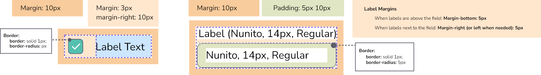
Input Fields
- Input fields maintain a consistent height, but their length can vary to accommodate different design requirements
- Labels can be positioned either above or beside the field, depending on the layout
- Hidden input fields, such as Cc and Bcc, remain collapsed by default and only appear when the user selects an option to reveal them.
- For RDoc fields, see SMART Referrals
Cc
Bcc
Date Fields
Content here
Radio Buttons
- Represent mutually exclusive choices, meaning users can select only one choice per group
- Each button is limited to either a "selected" or "not selected" state
- When an indeterminate state must be represented, consider using checkboxes instead
- For RDoc radio buttons, see SMART Referrals
Toggle Switches
- Represent a binary state
- Provide a clear and immediate visual indication of an on/off state
- Typically used for settings or options that can be turned on or off
CSS Properties
/*CHECKBOXES*/

    .checkbox-container {
        display: flex;
        align-items: center;
        margin: 5px;
    }
    .checkbox-aios {
        appearance: none;
        cursor: pointer;
        background-color: var(--White);
        width: 20px;
        height: 20px;
        border: 1px solid var(--Grey-ml);
        border-radius: 5px;
        margin-right: 10px;
        position: relative;
        flex: 0 0 auto;
    }
    .checkbox-aios + label {
        cursor: pointer;
        font-size: 14px;
        font-family: var(--base-font-family);
    }
    .checkbox-aios:checked,
    .checkbox-aios::after {
        background-color: var(--PuertoRico);
        border: 1px solid var(--PuertoRico);
        background-image: url("data:image/svg+xml,%3Csvg xmlns='http://www.w3.org/2000/svg' height='24px' viewBox='0 0 24 24' width='24px' fill='%23FFFFFF'%3E%3Cpath d='M0 0h24v24H0V0z' fill='none'/%3E%3Cpath d='M9 16.2l-3.5-3.5c-.39-.39-1.01-.39-1.4 0-.39.39-.39 1.01 0 1.4l4.19 4.19c.39.39 1.02.39 1.41 0L20.3 7.7c.39-.39.39-1.01 0-1.4-.39-.39-1.01-.39-1.4 0L9 16.2z'/%3E%3C/svg%3E");
        background-repeat: no-repeat;
        background-position: center;
        background-size: cover;
    }
    .checkbox-aios:hover {
        border: 1px solid var(--Grey-md);
    }
    .checkbox-aios:disabled {
        cursor: not-allowed;
        border: 1px solid var(--Grey-l);
        background-color: var(--Grey-xxl);
    }
    .checkbox-aios:disabled + label {
        color: var(--Grey-d);
        cursor: not-allowed;
    }
    .checkbox-aios:checked:disabled,
    .checkbox-aios::after {
        background-color: var(--Grey-l);
        background-image: url("data:image/svg+xml,%3Csvg xmlns='http://www.w3.org/2000/svg' height='24px' viewBox='0 0 24 24' width='24px' fill='%23777986'%3E%3Cpath d='M0 0h24v24H0V0z' fill='none'/%3E%3Cpath d='M9 16.2l-3.5-3.5c-.39-.39-1.01-.39-1.4 0-.39.39-.39 1.01 0 1.4l4.19 4.19c.39.39 1.02.39 1.41 0L20.3 7.7c.39-.39.39-1.01 0-1.4-.39-.39-1.01-.39-1.4 0L9 16.2z'/%3E%3C/svg%3E");
    }
    .checkbox-aios:indeterminate {
        background-color: var(--White);
    }
    .checkbox-aios:indeterminate::after {
        content: "";
        position: absolute;
        left: 50%;
        top: 50%;
        transform: translate(-50%, -50%);
        width: 12px;
        height: 12px;
        background: var(--PuertoRico-l);
        border: none;
        border-radius: 4px;
        align-items: center;
    }


/*INPUT FIELDS*/

    .aios-field-container {
        display: flex;
        margin: 10px;
    }
    .aios-field-label-top {
        font-size: 14px;
        color: var(--Black);
        font-family: var(--base-font-family);
        margin-bottom: 5px;
    }
    .aios-field-label-left {
        font-size: 14px;
        color: var(--Black);
        font-family: var(--base-font-family);
        align-self: center;
        width: 100%;
    }
    .aios-field {
        height: 30px;
        font-size: 14px;
        padding-left: 10px;
        color: var(--Black);
        background-color: var(--White);
        border: 1px solid var(--Grey-l);
        border-radius: 5px;
        font-family: var(--base-font-family);
        outline: none;
        transition: 0s;
        width: 100%;
        padding: 10px 35px 10px 10px;
        box-sizing: border-box;
    }
    .aios-field::placeholder {
        color: var(--Grey-ml);
        font-family: var(--base-font-family);
    }
    .aios-field:hover {
        border-color: var(--Grey-md);
    }
    .aios-field:focus {
        border-color: var(--PuertoRico);
    }
    .aios-field:disabled {
        background-color: var(--Grey-xxl);
        border-color: var(--Grey-l);
        cursor: not-allowed;
        color: var(--Grey-l);
    }
    .aios-field:disabled::placeholder {
        color: var(--Grey-d);
    }
    .aios-field:disabled:not([value=""]) {
        color: var(--Grey-d);
    }
    .number-input {
        padding-right: 5px;
    }

/*SELECT DROPDOWNS*/

    .select-container,
    .multi-select-container {
        position: relative;
        display: inline-block;
        width: 100%;
        cursor: pointer;
        font-family: var(--base-font-family);
        margin: 5px;
    }
    .selected-option {
        height: 30px;
        font-size: 14px;
        padding: 10px 35px 10px 10px;
        color: var(--Black);
        background-color: var(--White);
        border: 1px solid var(--Grey-l);
        border-radius: 5px;
        display: flex;
        align-items: center;
        justify-content: space-between;
        box-sizing: border-box;
        transition: border-color 0s;
    }
    .selected-option:hover {
        border-color: var(--Grey-md);
    }
    .select-container.open .selected-option,
    .multi-select-container.open .selected-option {
        border-color: var(--PuertoRico);
    }
    .selected-option::placeholder {
        color: var(--Grey-md);
    }
    .select-arrow {
        position: absolute;
        right: 10px;
        top: 50%;
        transform: translateY(-50%);
        color: var(--Grey-ml);
        pointer-events: none;
        transition: color 0.0s, transform 0.3s;
    }
    .select-container.open .select-arrow,
    .multi-select-container.open .select-arrow {
        color: var(--PuertoRico);
        transform: translateY(-50%) rotate(180deg);
    }

    /* Options list */
        .select-container .options-list,
        .multi-select-container .options-list {
            display: none;
            position: absolute;
            top: 100%;
            left: 0;
            width: 100%;
            background-color: var(--White);
            box-shadow: 0px 3px 6px rgba(0, 0, 0, 0.15);
            border-radius: 5px;
            z-index: 1;
            max-height: 200px;
            overflow-y: auto;
            box-sizing: border-box;
            list-style-type: none;
            padding: 0;
            margin: 0;
        }
        .select-container.open .options-list,
        .multi-select-container.open .options-list {
            display: block;
        }

        /* Each option */
            .select-container .options-list .option,
            .multi-select-container .options-list .option {
                padding: 9px;
                color: var(--Black);
                font-size: 14px;
                white-space: nowrap;
                cursor: pointer;
            }
            .select-container .options-list .option:hover,
            .multi-select-container .options-list .option:hover {
                background-color: var(--Grey-xl);
            }


/*RADIO BUTTONS*/

    .radio-container {
        display: flex;
        align-items: center;
        margin: 5px;
    }
    .radio-aios {
        appearance: none;
        cursor: pointer;
        background-color: var(--White);
        width: 20px;
        height: 20px;
        border: 1px solid var(--Grey-ml);
        border-radius: 50%;
        margin-right: 10px;
        position: relative;
        flex: 0 0 auto;
    }
    .radio-aios + label {
        cursor: pointer;
        font-size: 14px;
        font-family: var(--base-font-family);
    }
    .radio-aios:checked {
        background-color: white;
        border: 1px solid var(--Grey-ml);
    }
    .radio-aios:checked::after {
        content: '';
        position: absolute;
        top: 50%;
        left: 50%;
        width: 10px;
        height: 10px;
        background-color: var(--PuertoRico);
        border-radius: 50%;
        transform: translate(-50%, -50%);
    }
    .radio-aios:hover {
        border: 1px solid var(--Grey-md);
    }
    .radio-aios:disabled {
        cursor: not-allowed;
        border: 1px solid var(--Grey-l);
        background-color: var(--Grey-xxl);
    }
    .radio-aios:disabled + label {
        color: var(--Grey-d);
        cursor: not-allowed;
    }
    .radio-aios:checked:disabled::after {
        background-color: var(--Grey-md);
    }


/* TOGGLE SWITCHES */

    /*The switch and its elements*/
        .aios-toggle-container {
            display: flex;
            align-items: center;
            margin: 5px;
        }
        .toggle-checkbox {
            display: none;
        }
        .toggle-slider {
            position: relative;
            width: 40px;
            height: 20px;
            background-color: var(--Grey-ml);
            border: 1px solid var(--Grey-ml);
            border-radius: 20px;
            cursor: pointer;
            flex: 0 0 auto;
        }
        .toggle-switch {
            position: absolute;
            width: 16px;
            height: 16px;
            background-color: var(--White);
            border-radius: 50%;
            top: 2px;
            left: 2px;
            transition: left 0.3s;
        }
        .toggle-label {
            margin-left: 10px;
            font-size: 14px;
            color: var(--Black);
            font-family: var(--base-font-family);
            cursor: pointer;
        }
        .toggle-checkbox:checked + .toggle-slider {
            background-color: var(--PuertoRico);
            border-color:  var(--PuertoRico);
        }
        .toggle-checkbox:checked + .toggle-slider .toggle-switch {
            left: 22px;
        }

    /*hover state*/
        .toggle-slider:hover {
            border-color: var(--Grey-md);
        }
        .toggle-checkbox:checked + .toggle-slider:hover {
            border: 1px solid var(--Grey-md);
        }

    /*disabled state*/
        .toggle-checkbox:disabled + .toggle-slider {
            background-color: var(--Grey-xxl);
            border-color: var(--Grey-l);
            cursor: not-allowed;
        }
        .toggle-checkbox:disabled:checked + .toggle-slider:hover {
            border: 1px solid var(--Grey-l);
        }
        .toggle-checkbox:disabled + .toggle-slider .toggle-switch {
            background-color: var(--Grey-l);
        }
        .toggle-checkbox:disabled ~ .toggle-label {
            color: var(--Grey-d);
            cursor: not-allowed;
        }